-
Okay so @WestsTigers have evolved their logo and everyone is already complaining about it. As with all rebrands — try to understand what a brand is trying to achieve before you write it off! Time for a quick thread with some *speculation* about some of the design goals here 🧵
-
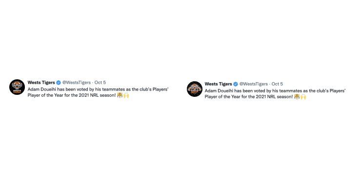
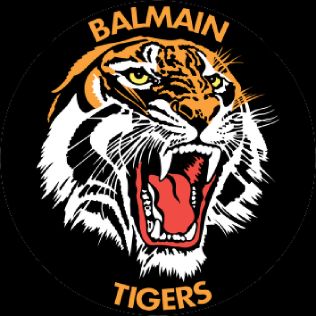
(in the tweet above the left one is the new version, right one is the old) The new version is radically simplified: the tiger has been "declawed" — metaphor for the tiger's season? — and there is a *lot* less going on. Pay attention to whiskers, teeth, stripes.
-
We're down to two colors in the new logo rather than four in the old, and we've now got PHAT outlines. We'll see how this becomes important later! Stay tuned.
-
The ragged underline underneath the logotype has been removed. Type now sits clearly on the field below. The nod to the kinetic energy of the underline is maintained with those lil left-leaning overshoots on the letters. The logo type still looks "speedy", doesn't it?
-
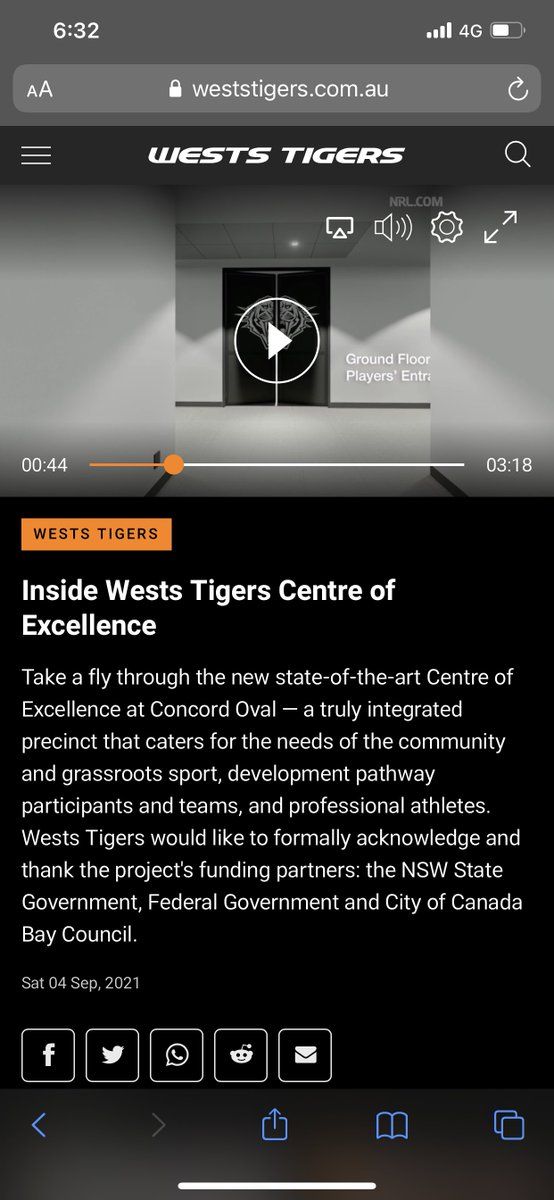
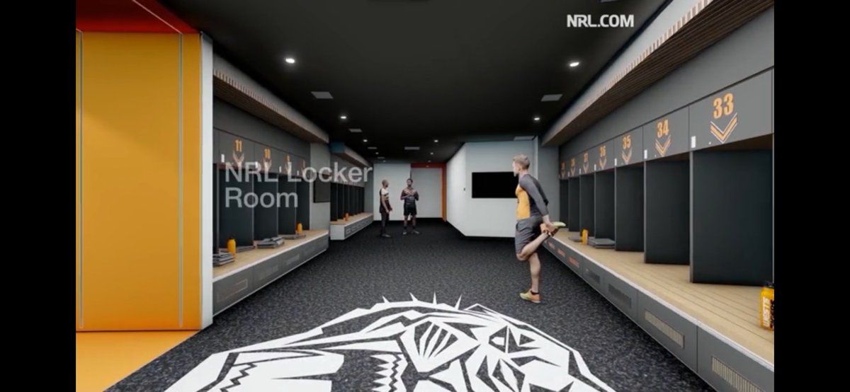
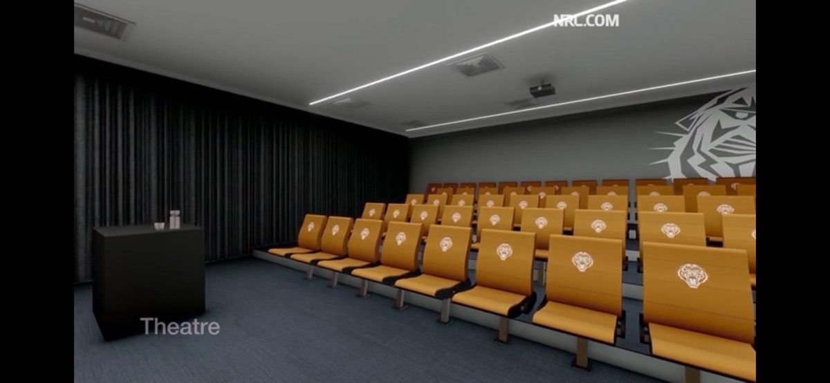
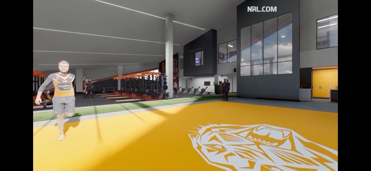
^(Twitter will probably mangle the compression of those examples, which may well prove my point further) Let's talk about the BIG applications of the logo, such as _literallly everywhere_ all over their planned Centre of Excellence development: weststigers.com.au/news/2021/09/04/inside-wests-tigers-centre-of-excellence/
-
You can see how when reduced to a monochrome version and blown up huge, the old logo begins to feel busy (it relies on color quite a bit to distinguish elements), and it doesn't have the same impact when contrasting against a backdrop. Look at the little whiskers in particular
-
All in all, I think they've done a pretty good job here. I rate it. It's functional and modern, and will work in extremely small and extremely large usages. Good on em. Good luck with the rest of the roll out — I'm particularly excited to see their 2022 kits
