-
So interesting — I did some user testing with my partner yesterday for a product I am working on (note: she is not in the tech industry at all) and I'm dying to dig more into her sense of aesthetics on the web and unpack some of it. 👇
-
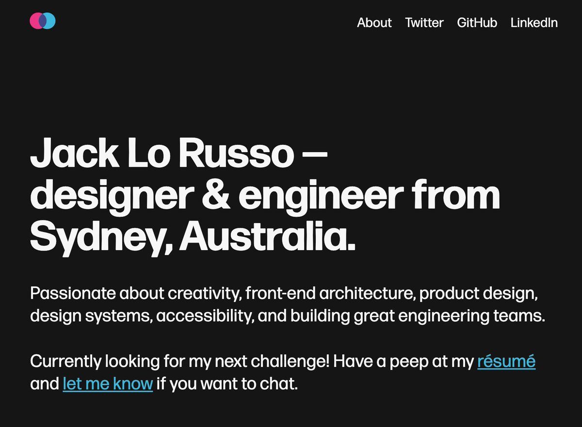
She associated mostly un-styled hyperlinks (blue color, text-decoration: underline) with the UI "looking broken". She said "am I on Wikipedia?" Some text on a grey background (rather than white) made her feel like it was an error state. Tiny examples but so interesting to me 🤩
-
I've done user testing many times before, but it was cool to do it with someone who was both: a) Far enough from the domain and industry — she was just commenting from her gut feel and prior experience b) *Actually comfortable enough* with me to speak freely and think out loud
-
In general, the test just re-affirmed what we all know but still sometimes forget: leaning on familiar UX and UI design patterns is crucial for making users comfortable. Don't make them think, right? But it also highlights something else.
-
What was once familiar (eg. unstyled hyperlinks) now feels old and broken to a certain user. Over time, designs have eschewed the classic underlined hyperlink and now it's associated with slow webpages where styles and maybe JS haven't been applied...
